Color Theory for Beginners: Essential Design Tips
February 23, 2025
The Evolution of Color Theory Through Time

Color theory is not just a modern concept - it's a fascinating story that spans centuries and connects art, science, and human understanding. When we look at how people have thought about and used color throughout history, we can better grasp the principles that shape design and art today.
The foundations of color theory trace back to ancient times. One of the earliest written works on the subject is 'On Colors,' from Aristotle's school of thought around 322 BCE. This text proposed that colors exist between light and dark, and suggested four basic colors came from natural elements: fire, air, water, and earth. Learn more about the historical development of color theory here.
Early Understandings of Color
Ancient cultures saw deep meaning in colors beyond their visual appeal. Egyptian artists and builders used specific colors to express religious and cultural ideas in their work. The Greeks viewed color through the lens of philosophy, connecting different hues to elements of nature and the universe. These early views show how color held both practical and spiritual significance.
The Influence of Scientific Thought
Science brought new clarity to our understanding of color. In the 1600s, Sir Isaac Newton's work with prisms showed that white light contains all the colors of the rainbow. This discovery marked a huge shift - color was no longer just what we felt or believed, but something we could measure and study with scientific tools.
Goethe's Holistic Approach
Johann Wolfgang von Goethe took a different path in studying color. Rather than focus purely on physics like Newton, Goethe looked at how colors make us feel and think. His work explored how different colors work together and affect our emotions. This helped bridge the gap between the scientific and human experience of color.
Modern Applications and Digital Tools
These days, color theory shapes everything from art and design to marketing and psychology. Tools like ColorPageAI help people explore and apply color principles in fun, hands-on ways. Whether you're creating artwork, designing a website, or just playing with colors, these tools make it easier to understand and use color effectively.
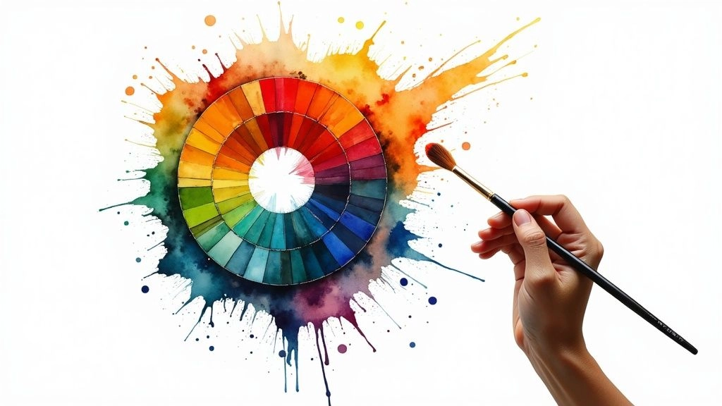
Mastering the Color Wheel: Your Design Foundation
Ready to explore color theory? Let's start with the most essential tool - the color wheel. This simple circular diagram helps you understand how colors work together to create eye-catching designs. We'll break down the key concepts so you can choose colors with confidence.
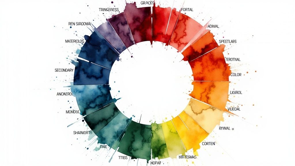
Understanding the Basics: Primary, Secondary, and Tertiary Colors
The building blocks of the color wheel are the primary colors: red, yellow, and blue. These pure colors can't be created by mixing other colors together - they're the foundation for everything else.
Secondary colors emerge when you mix two primary colors: green (blue + yellow), orange (red + yellow), and purple (red + blue). Think of them as the next generation of colors.
Tertiary colors fill in the gaps between primary and secondary colors on the wheel. Mix a primary color with its neighboring secondary color and you'll get colors like red-violet or yellow-green. These subtle variations give you even more creative options.
Exploring Color Relationships on the Wheel
Here's a helpful overview of how colors interact on the wheel:
| Relationship Type | Description | Example Colors | Common Uses |
|---|---|---|---|
| Complementary | Colors opposite each other | Red & Green | Creating bold contrast |
| Analogous | Colors next to each other | Blue, Blue-green, Green | Harmonious, natural looks |
| Triadic | Three evenly spaced colors | Red, Yellow, Blue | Balanced, vibrant designs |
| Split Complementary | One color + two adjacent to its complement | Blue, Yellow-Orange, Red-Orange | Softer contrast than complementary |
Fun fact: Isaac Newton laid the groundwork for modern color theory in his 1704 book 'Opticks.' He showed that white light contains all colors by splitting it with a prism. Learn more about color's fascinating history here.
Putting Theory into Practice: Color Wheel Exercises
Time to experiment with what you've learned! Start by creating a simple color scheme using three analogous colors - pick any color and use the two colors next to it. Notice how naturally they work together.
Try pairing complementary colors to see how they create energy and impact. These hands-on exercises help develop your eye for color combinations. For more practical applications, check out How to Create Coloring Pages: A Complete Guide.
Remember, mastering color takes practice. The more you work with the color wheel, the better you'll understand how to use colors effectively in your designs.
Creating Perfect Color Harmonies

Ready to take your design skills to the next level? Understanding color combinations is essential for creating eye-catching visuals. Let's explore how to build beautiful color schemes that will make your projects shine.
Exploring Core Color Harmonies
The basics of color combinations are easier than you might think. Here are the key color pairings that designers rely on:
-
Complementary Colors: These are colors directly across from each other on the color wheel, like red and green. They create bold contrast that grabs attention - perfect for headlines or important design elements. Just use them carefully, as too much can overwhelm the eye.
-
Analogous Colors: Think of colors that sit next to each other, like the warm oranges, reds and yellows in a sunset. These create a natural, soothing flow that's easy on the eyes. Nature uses these combinations all the time, which is why they feel so right.
-
Triadic Colors: Pick three colors spaced evenly around the color wheel (like red, yellow, and blue). This gives you rich contrast while keeping things balanced. It's great when you want energy without chaos.
-
Split-Complementary Colors: Start with one color, then use the two colors next to its complement. For example, with blue you'd use yellow-orange and red-orange. You get nice contrast but it's gentler than pure complementary colors.
Making Color Harmonies Work For You
Time to put these color concepts into action! Here's how to use them effectively:
-
Website Design: Make buttons pop using complementary colors against your background. Create a smooth, professional look with analogous colors for your brand palette.
-
Interior Design: Use analogous colors to make rooms feel peaceful and put-together. Want an energetic kids' room? Try triadic colors for playful energy.
-
Art Projects: Split-complementary colors add depth and interest to artwork. Use complementary colors to make certain areas stand out.
Fixing Common Color Problems
Running into issues? Here are some quick fixes: If complementary colors feel too intense, try making one color lighter or less saturated. When analogous colors seem boring, add a tiny pop of a contrasting color. The key is to keep experimenting until you find what works.
With practice, you'll develop an instinct for creating beautiful color combinations. Soon you'll be confidently choosing colors that perfectly match the mood and message of your projects.
Turn your kid into the star of the page
Upload one photo and get coloring pages of your own child. Print as many as you like.
Understanding the Power of Color Psychology
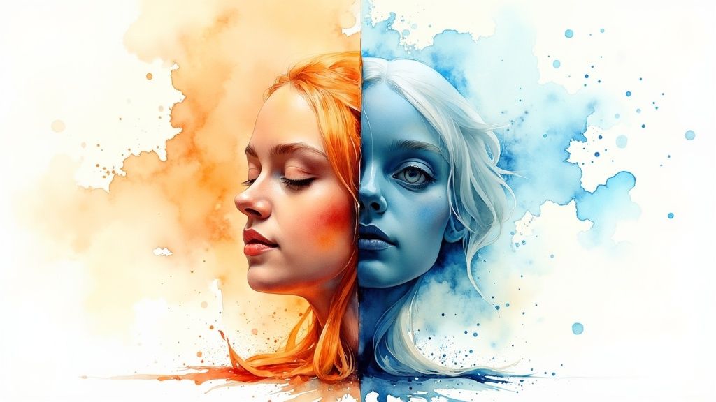
When we talk about color, we're not just discussing pretty shades and pleasing combinations. Color psychology explores how different hues affect our feelings, behaviors, and decisions. Whether you're an artist or marketer, understanding these effects can help you create more impactful work.
The Emotional Impact of Color
Ever notice how a bright red room makes you feel energized while a blue one calms you down? That's color psychology in action. Red often sparks excitement or signals danger, while blue promotes trust and peace. These reactions come from both our natural instincts and learned associations.
Cultural Considerations in Color Psychology
Colors speak different languages around the world. White represents purity and weddings in many Western countries but symbolizes mourning in parts of Asia. This shows why it's so important to know your audience when picking colors for any project - what works in one culture might send the wrong message in another.
How Brands Use Color Psychology
Look at your favorite brands' logos and you'll see color psychology at work. McDonald's chose their bright yellow because it makes people feel happy and energetic. Health brands often pick green to represent wellness and natural goodness. These aren't random choices - they're carefully picked to connect with customers.
Practical Applications of Color Psychology
Want to use these principles in your own work? Start by matching colors to your message. A meditation app might use soft blues and greens to help users relax, while a sports brand might choose bold reds and oranges to pump people up. For more ideas about using color to promote calm, check out our guide on The Best Adult Coloring Books for Creative Relaxation.
Color Meanings and Emotions
Here's a quick guide to common color associations, though remember these can change based on culture and context:
| Color | Positive Associations | Negative Associations | Best Used For |
|---|---|---|---|
| Red | Passion, Excitement, Energy | Danger, Anger, Aggression | Calls to action, attention-grabbing elements |
| Blue | Trust, Calmness, Stability | Sadness, Coldness | Corporate branding, websites promoting relaxation |
| Green | Nature, Growth, Harmony | Envy, Inexperience | Health and wellness brands, environmentally friendly products |
| Yellow | Happiness, Optimism, Creativity | Anxiety, Caution | Food brands, children's products |
| Purple | Luxury, Royalty, Wisdom | Mystery, Melancholy | High-end products, creative industries |
Understanding color psychology helps you create designs that not only look good but also make people feel something. Ready to put color psychology into practice? Learn more about Creating Coloring Pages with ColorPageAI.
Implementing Color Theory in Real Projects
Let's explore how to put color theory into practice. It's time to take your knowledge from theoretical concepts to real-world applications - whether you're designing digital interfaces, creating artwork, or planning your next project's color scheme.
Adapting Color Principles Across Different Mediums
Different mediums require different approaches to color. A bold color combination that pops on a website might look overwhelming in print. Screen-based projects need careful testing across devices to ensure colors display properly. For print work, paper type and ink heavily influence the final look, making color proofing essential.
Consider testing your digital colors under various lighting conditions and screen settings. With print projects, always get physical proofs to check how colors actually appear on your chosen materials.
Practical Techniques for Color Consistency
Start every project by creating a color palette or mood board. This visual guide helps maintain consistency and ensures your colors work well together. Keep your palette simple at first - you can always add more colors later if needed.
Using color management tools helps capture and match specific colors accurately across your design elements. Save your color codes (like hex values for web or CMYK for print) in an easily accessible format.
Troubleshooting Common Color Challenges
When colors clash or create unwanted effects, consult your color wheel. It can help explain why certain combinations feel off and guide you toward better alternatives. If complementary colors feel too intense, try using split-complementary colors instead for a more balanced look.
Poor contrast between text and backgrounds is another common issue. Always check your contrast ratios, especially for text readability. This is particularly important for making your designs accessible to all users. Learn more about color accessibility in Digital Transformation in Education.
Color Management and Quality Control
Good color management starts with properly calibrated screens and extends to using the right color profiles for different output methods. Regular monitor calibration and consistent profile usage help ensure your colors stay true from concept to final product.
Expert Tips for Beginners
- Start with 2-3 main colors and build from there
- Play with lighter and darker versions of your chosen colors
- Create multiple variations before settling on a final palette
- Test your colors in the actual environment they'll be used in
- Keep an inspiration folder of color combinations you like
Remember - mastering color takes practice and experimentation. Don't be afraid to try new combinations and learn from both successes and mistakes. Tools like ColorPageAI make it easy to explore different color options safely before committing to final designs.
Avoiding Critical Color Theory Mistakes
Starting with color theory can be exciting, but many beginners make common mistakes that affect their designs. Let's explore key pitfalls to avoid so you can create appealing, effective, and accessible designs that work for everyone.
The Importance of Contrast
Poor contrast is one of the biggest mistakes in color design. When text and background colors are too similar, content becomes hard to read. For example, using very light gray text on a white background makes content nearly impossible to see. Web accessibility guidelines require strong contrast ratios to ensure everyone, including those with visual impairments, can easily read and interact with content.
Overusing Bright Colors
While bold colors can add impact, using too many creates visual chaos. Picture a webpage with neon green text on a bright red background - it's jarring and hard on the eyes. Instead, pick one or two bright shades as accent colors to highlight important elements. This measured approach lets you use vivid colors effectively without overwhelming viewers.
Ignoring Color Psychology
Colors trigger emotional and cultural responses that affect how people perceive your design. Using inappropriate colors, like bright red for a meditation app, can send conflicting messages. Take time to research color meanings and associations for your target audience. This helps ensure your color choices support rather than detract from your design goals.
Lack of Color Harmony
Random color combinations often look messy and unprofessional. Using established color relationships like complementary or analogous schemes creates visual unity. Study the color wheel to find pleasing combinations that set the right mood. Well-coordinated colors make designs look polished and intentional.
Accessibility Oversights
Never overlook color blindness when choosing colors. About 8% of males and 0.5% of females experience color vision deficiency. Test your designs with color blindness simulation tools to ensure they work for everyone. Making colors accessible benefits all users, not just those with visual impairments.
Want to create beautiful coloring pages without stressing about color theory? ColorPageAI generates personalized, printable coloring pages instantly, with many styles to choose from. Start creating your own unique designs today! Try ColorPageAI now
Turn your kid into the star of the page
Upload one photo and get coloring pages of your own child. Print as many as you like.