How to Color Mandalas for Stunning Results
August 14, 2025
There’s something almost magical about coloring a mandala. It’s a beautifully simple, rewarding practice that perfectly blends art with a sense of peace. You just pick your colors and start filling in the intricate, symmetrical patterns, and before you know it, you’ve entered a state of relaxed, creative focus.
Your Journey into Mindful Coloring
Welcome to the wonderfully calming world of mandala coloring! I’ve found this practice is just as much about mindfulness as it is about creating something beautiful. Think of this guide as your personal roadmap, walking you through everything you need to know about how to color mandalas and turning a simple hobby into a truly accessible form of self-care.
It's More Than Just Coloring
At its heart, coloring a mandala is an exercise in being present. I know from experience that the simple act of choosing a color and carefully filling in a geometric shape helps quiet a busy mind. It's almost like a switch flips. You find yourself slipping into a state of creative flow where the day's stresses just seem to melt away.
It's a fantastic opportunity to unplug from all the digital noise and reconnect with yourself through a simple, hands-on activity.
So, what makes these circular designs so captivating? A big part of their appeal is their rich history.
The tradition of coloring mandalas is deeply rooted in spiritual and religious history, originating from India around the first century BCE. Early mandalas appeared primarily within Buddhist art and were used as sacred symbols representing the universe.
As Buddhist monks traveled along the historic Silk Road, they didn't just spread their beliefs—they also brought the art of creating mandalas with them. This incredible journey introduced the practice to South Asia, touching regions like Kashmir, the Hindu Kush, Pakistan, and Afghanistan.
The Modern Mindful Practice
Fast forward to today, and you absolutely don't need to be a spiritual guru to enjoy the benefits. Mandala coloring has been embraced across the globe as a powerful tool for stress relief and a fantastic outlet for creativity. It gives you structure without being rigid, which leaves plenty of room for your own personal interpretation through color.
This unique balance makes it an ideal activity for anyone, regardless of whether you consider yourself "artistic" or not.
Here are a few of the benefits I've seen people experience firsthand:
- Reduced Anxiety: The repetitive motion of coloring can be incredibly soothing. It's a proven way to help lower stress levels.
- Improved Focus: When you concentrate on filling in all the tiny, intricate details, you're giving your focus and attention span a real workout.
- Creative Expression: It’s a low-pressure way to play with color and design. You get all the fun of creating without having to stare at a blank page.
This guide will give you the practical know-how to start your own journey with confidence. And if you get the creative bug and want to explore other avenues, I highly recommend delving deeper into the world of crafting.
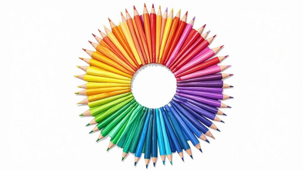
Choosing Your Mandala Coloring Tools
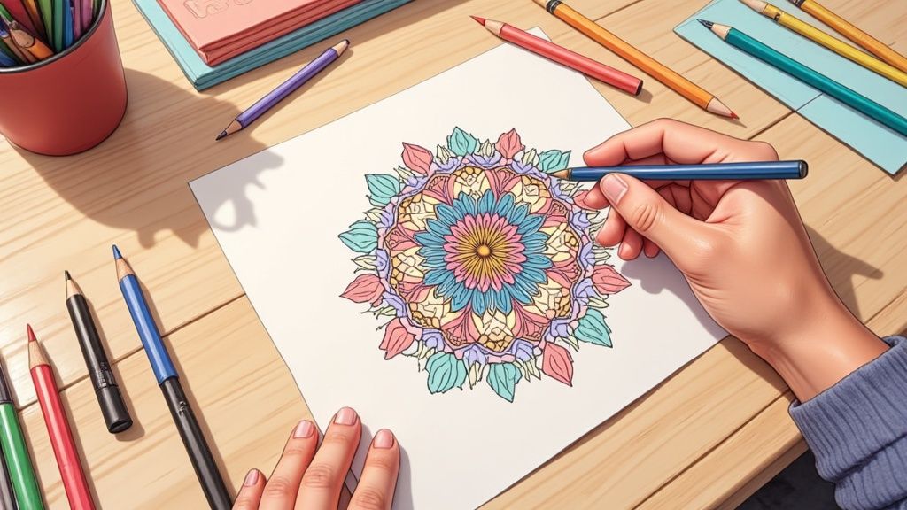
Alright, before you dive in and start bringing your mandala to life, let’s talk about the fun part: your tools. The supplies you choose can completely transform your coloring experience and, of course, the final look of your artwork. Thinking about how to color mandalas is more than just picking pretty shades; it's about finding the right medium to make your vision a reality.
For instance, if you're tackling a mandala with tons of tiny, intricate spaces, a set of fine-tip markers will be your best friend. They give you those crisp, sharp lines and bold, consistent color that really makes detailed patterns pop. On the other hand, if you're dreaming of creating soft, gentle transitions and a more painterly effect, you'll want to reach for a good set of colored pencils.
This is a perfect example of how smoothly you can blend colored pencils to create those beautiful, seamless gradients.
The real magic here is in the pencil's tip. It gives you incredible control over pressure, letting you layer colors from light to dark for a rich, dimensional finish that’s hard to get with anything else.
Comparing Your Best Coloring Tool Options
Every tool offers a unique feel and a different result. Honestly, there's no single "best" option—it all boils down to the effect you’re going for and your personal style. Do you love vibrant, flat colors, or are you all about soft, textured shading?
To help you decide what’s right for your next project, I’ve put together a quick comparison of the most popular tools. This table breaks down their ideal uses, strengths, and weaknesses.
| Tool | Best For | Pros | Cons |
|---|---|---|---|
| Colored Pencils | Soft blending, shading, and creating gradients. | Excellent control over color intensity; easy to layer and mix colors directly on the page. | Can be time-consuming to build up rich color; lower-quality pencils can be waxy or break easily. |
| Gel Pens | Adding metallic or glittery accents and fine details. | Opaque ink covers other colors well; available in a huge variety of effects like neon and glitter. | Ink can skip or blob; takes time to dry and can smear easily if you're not careful. |
| Fine-Tip Markers | Crisp lines, bold colors, and filling small sections. | Provides vibrant, saturated color with minimal effort; great for creating a clean, graphic look. | Can bleed through thinner paper; mistakes are permanent and hard to fix. |
| Alcohol Markers | Seamless blending and professional, streak-free results. | Colors blend beautifully without damaging the paper; dual tips (brush and chisel) offer versatility. | They are more expensive and will bleed through most papers, requiring a special type of paper. |
After looking at the options, you can see how the choice really shapes the outcome. It's a fun part of the process, almost like a chef picking their knives for a specific dish!
Paper Quality Matters More Than You Think
Here’s a pro tip: the tool you choose is only half the equation. The paper you color on plays a massive role in how your work turns out. Using the wrong paper can lead to a lot of frustration—I’m talking bleeding, feathering, or colors that just look disappointingly dull.
- For markers, especially the alcohol-based kind, you need thick, smooth, coated paper. This stops the ink from soaking through and spreading, keeping your lines clean and crisp.
- For colored pencils, a paper with a bit of "tooth" (a slight texture) is ideal. That texture grabs the pigment, allowing you to build up multiple layers for deep, rich shading.
Remember, standard printer paper is generally not your friend for serious coloring. It's just too thin and absorbent for most mediums, which often leads to disappointment. Investing in a quality coloring book or a pad of artist-grade paper is a small change that yields huge results.
If you’re just starting out and want to experiment without a big investment, you can find a wonderful variety of designs in our collection of mandala art coloring sheets. They're perfect for printing on different paper types so you can test what works best for your chosen tools before committing to a full book.
Ultimately, finding that perfect tool-and-paper combination will make your coloring sessions so much more relaxing and the results far more rewarding. Happy coloring
A creative activity worth losing track of time in
Type any idea and get a printable coloring page back. Five free pages to start.
Crafting Your Perfect Color Palette

This is where the real magic happens. A thoughtful color palette can take a simple design and turn it into a showstopper—a piece that tells a story or just makes you feel something. When you're figuring out how to color mandalas, this is where your creativity truly gets to play.
Don't get spooked by the term "color theory." I promise it's not a rigid rulebook. Think of it more like a friendly guide that helps your colors get along. Just knowing a few basics can make a world of difference in creating a mandala that feels balanced and beautiful.
Finding Color Harmony
Harmony is just a fancy word for making things look good together. When colors are in harmony, they create a sense of order and are just plain pleasing to the eye. The good news is, there are some classic, practically foolproof color schemes that can get you there.
A fantastic place to start is with a complementary color scheme. These are colors sitting directly across from each other on the color wheel—think blue and orange, or purple and yellow. The high contrast makes everything feel vibrant and energetic. It really pops.
Another gorgeous option is an analogous scheme. This just means picking three colors that are neighbors on the color wheel, like blue, blue-green, and green. This approach is your ticket to a serene, comfortable design that often feels like it was plucked right out of nature.
And then there's the triadic scheme, which uses three colors spaced evenly around the wheel, forming a triangle. The classic example is red, yellow, and blue. This combo is bold and dynamic, giving you high contrast while still feeling balanced.
Key Takeaway: You don't need to be a master artist to pick great colors. Start with a simple scheme like complementary or analogous. It takes the guesswork out and gives you a solid foundation for a beautiful mandala.
Want to geek out a little more on this stuff? You can explore the fundamentals in our friendly guide to color theory for beginners.
Drawing Inspiration from Your World
Honestly, the best color palettes often come from the world around you, not just a color wheel. Inspiration is everywhere! Look at a wild sunset, a field of flowers, or even your favorite photograph. These real-world scenes have a natural harmony you can borrow for your art.
Your own emotions are another powerful source of inspiration.
- Feeling calm and peaceful? Maybe you'll find yourself reaching for cool blues, soft purples, and gentle greens.
- Feeling energetic and joyful? Bright yellows, vibrant oranges, and bold reds might be calling your name.
- Feeling introspective or a bit mysterious? A palette of deep indigos, rich burgundies, and dark teals could capture that mood perfectly.
Think of your mandala as a visual journal entry. The colors you pick can be a snapshot of your thoughts and feelings in that moment. When you let your intuition guide you, you create something that’s not only beautiful but deeply personal. There’s no right or wrong here; it’s all about what feels right to you.
A Simple Process for Coloring Mandalas
Okay, you've got your tools ready and a palette in mind. Now for the fun part—bringing that beautiful mandala to life. Staring at a blank page can feel a little intimidating, but trust me, having a simple, repeatable process takes all the pressure off. Knowing how to color mandalas with a bit of a plan lets you sink into that relaxing, creative zone.
There's no single "right" way to start. The real secret is finding a rhythm that just feels good to you.
A lot of people I know love to start at the center of the mandala and work their way outward. It’s a very natural approach, almost like watching a flower bloom on the page. As you add each ring of color, the design grows organically from its core.
On the flip side, you could start from the outer edges and work your way inward. This can feel like you're gathering and focusing all the design's energy right into the middle. Both ways create a wonderful sense of balance and flow. Give each a try and see which one you vibe with!
Create Harmony with Repetition
Here’s one of my favorite tricks for making a mandala look instantly cohesive and harmonious: focus on one color at a time. The mesmerizing beauty of a mandala is all in its symmetry and repeating patterns, and you can totally use that to your advantage.
Here's a simple workflow you can try right now:
- Pick one color from your palette.
- Find a specific, repeating shape in the design—like a small petal or a triangle.
- Color every single instance of that shape with your chosen color.
- Once they're all filled, grab your next color and pick a different repeating shape.
This method does a couple of brilliant things. First, it guarantees a balanced spread of color across the whole piece, so no one section feels too heavy or neglected. It also creates this really meditative rhythm as you hunt for and fill each identical part. It's incredibly calming.
This structured-yet-flexible approach is precisely what makes coloring mandalas such a powerful mindfulness tool. By focusing on a simple, repeatable task, you give your brain a gentle anchor, allowing all those distracting thoughts to just drift away.
And this isn't just a feeling—science is starting to back it up. Research on the psychological effects of coloring mandalas shows it can give your well-being a significant boost, especially when done with others. You can read more about the fascinating findings on mandala coloring and its therapeutic effects.
Your Personal Coloring Story
While having some structure is great, don't ever forget that this is your creative space. This isn't just about filling in the lines; it's about telling a story with color. Some people even use their mandala time as a form of visual journaling, letting their mood on any given day guide the whole process.
Instead of planning every single move, you could try a more intuitive flow. Start somewhere—anywhere—and just see where the colors take you.
- Focus on the journey, not on creating a "perfect" masterpiece.
- Let colors, lines, and even little doodles emerge as they come to you.
- Pay attention to what you're feeling and thinking as you color.
When you’re done, you won't just have a beautiful piece of art. You'll have a snapshot of a moment in time, a reflection of your inner world captured in ink and paper. This transforms the simple act of coloring into something deeply personal and insightful.
Techniques to Make Your Mandalas Pop
Alright, you've got the basics down. You're comfortable with your tools, and you've found a good rhythm. Now, it's time for the really fun part—learning the little tricks that can elevate your mandalas from a relaxing pastime to a genuine piece of art. This is where we add depth, dimension, and that special flair that makes people say, "Wow, you colored that?"
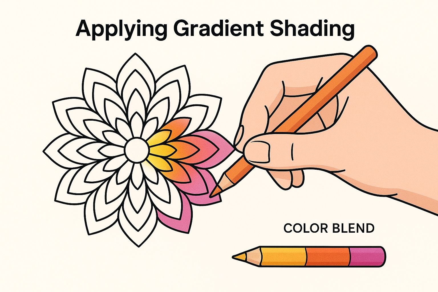
Let's dive into one of the most impactful techniques: blending and shading. This is where your colored pencils truly get to show off. Instead of just filling a section with one flat color, think in layers. Try grabbing two or three shades from the same color family.
Imagine you're coloring a single petal. Start with your darkest blue near the base or outer edges, then transition to a medium blue in the middle, and finish with your lightest blue at the very center or tip. Gently overlap the colors to create a seamless, beautiful gradient. This simple trick instantly gives the shape a 3D feel, as if it's curving right off the page.
Pro Tip: A colorless blender pencil is an absolute game-changer here. It works like magic to smooth out the transitions between your colored pencil layers, creating an almost paint-like finish.
Adding Highlights and Texture
To really make your colors sing, you need to introduce some light. A white gel pen is your best friend for this. Once you've laid down your colors and blended them, go back in and add tiny dots, thin lines, or even small curved patterns where you imagine light would hit. This creates an eye-catching shimmer and a burst of vibrancy. It's the final touch that breathes life into the design.
You can also create a ton of visual interest by playing with texture, especially in the larger, more open sections of a mandala. Instead of solid color, try filling a space with small, repeating patterns.
- Tiny Circles: Fill a section with tiny, overlapping circles. It gives off a cool, bubbly, or pebbled effect.
- Hatching Lines: Use fine, parallel lines going in one direction (hatching) or crisscrossing lines (cross-hatching) to build up tone and texture.
- Stippling: This involves creating an image with tons of tiny dots. Place them closer together for darker, shaded areas and further apart for lighter spots. It’s meditative in its own right!
These small details add a whole new layer of complexity, drawing the viewer's eye deeper and deeper into your work. For even more ways to level up your coloring game, take a look at our adult's guide to coloring.
Thinking Beyond the Page
The idea of the mandala is ancient and extends far beyond the pages of our coloring books. The scale can be truly mind-boggling. For instance, using satellite imagery, researchers found five massive mandala-shaped geoglyphs in India, with one covering a staggering 55 acres. These incredible creations, totally invisible from the ground, show us that mandalas have also been monumental architectural features throughout history. You can learn more about these massive mandala constructions on Wikipedia.
The most important technique of all? Just let go and have fun. Don't be afraid to experiment! Mix your colored pencils with markers, try color palettes you think might clash, and add your own little doodles into the patterns. This is your playground.
Remember, every single line and color you add is part of the unique story of your piece. There's no right or wrong way to do this. The real goal is to get lost in the process and create something that feels 100% you. So grab your tools, let your creativity run wild, and watch your mandalas pop.
Alright, let's get into some of the questions I see pop up all the time from fellow mandala lovers. As you dive deeper into coloring, you're bound to hit a few snags or wonder how to take your art to the next level. Let's clear up some of that confusion.
"I'm terrified of making a mistake!"
I hear this one constantly, especially from newcomers. That fear of one little slip of the hand "ruining" an entire piece can be totally paralyzing. But let me tell you, it happens to every single one of us, and it's almost always fixable!
If you're working with colored pencils, a good artist-grade eraser can be your best friend, often lifting the pigment clean off the page without a trace. Working with markers? That's even easier. Just lean into the "mistake" and go over it with a darker, bolder color from your palette. You can even use it to create an unexpected shadow. I've also found that a white gel pen can work wonders, acting like a tiny, precise bottle of Wite-Out for small smudges.
Honestly, the whole point of coloring mandalas is to relax and let your creativity flow, not to chase some impossible standard of perfection. Every "mistake" is just an unplanned part of your unique piece.
"How do I stop my colors from looking so flat?"
This is a fantastic question because it's where the real magic happens. Taking your mandalas from "nice" to "wow" is all about creating depth and dimension. It sounds way more technical than it actually is.
The simplest trick in the book is to use two or three shades of the same color family within a single element. For instance, if you're coloring a petal, use your darkest shade right along the edges, blend it into a medium shade for the body, and leave the very center the lightest. This simple layering instantly creates a subtle 3D effect that makes your colors sing.
"Does the paper I use really matter that much?"
Yes, a thousand times, yes! The paper you color on is just as crucial as the pencils or markers you use. I'd even argue it's often the hidden reason behind a lot of common coloring frustrations.
It really breaks down by your tool of choice:
- For Markers: Bleeding and feathering are the enemy. You need a thick, smooth paper that won't let the ink soak through. Many coloring books now offer specialized marker paper for this exact reason.
- For Colored Pencils: You want a paper with a little bit of "tooth" — a very fine texture. This texture is what grabs the pigment from your pencil, allowing you to build up those rich, beautiful layers needed for smooth blending.
Your standard office printer paper just won't cut it. It’s too thin and absorbent, which is why markers can look splotchy and pencils can look dull and faded. Seriously, one of the best upgrades you can make for your coloring hobby is investing in a good quality coloring book or a pad of artist paper. It makes a world of difference.
Ready to create something truly unique without having to draw it yourself? At ColorPageAI, you can generate one-of-a-kind coloring pages from your own imagination. Describe any scene, and our AI will bring it to life in seconds, perfect for kids and adults alike. Start creating your first five custom coloring pages for free at https://colorpage.ai.
A creative activity worth losing track of time in
Type any idea and get a printable coloring page back. Five free pages to start.