What Is Color Psychology and How It Shapes Decisions
November 25, 2025
Have you ever noticed how fast-food chains seem to love red, or why spas are almost always painted in soft blues and greens? That's not a coincidence. It’s color psychology in action.
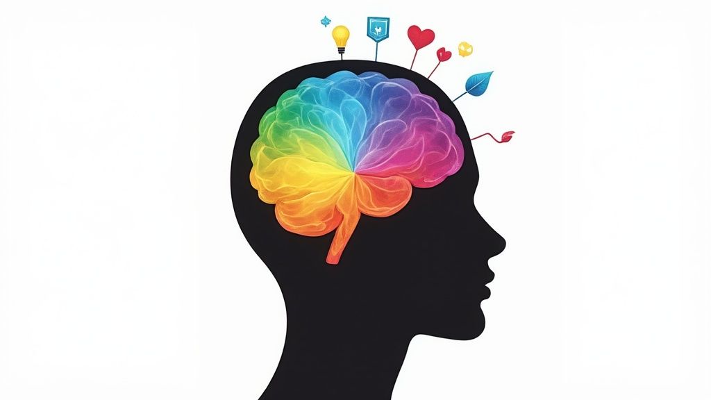
At its core, color psychology is the study of how different hues influence our behavior and feelings. Think of it as a powerful, unspoken language. Colors send subconscious signals that can trigger very real emotional and even physical responses.
Decoding the Language of Color
The choices brands and designers make are rarely random. They are deeply rooted in understanding this invisible language that shapes our world, guiding everything from the products we buy to the mood of a room.
This is the force that can make us feel energized, calm, trusting, or even hungry—often without us consciously realizing it.
Key Principles at Play
Color psychology isn't about one color having a single, rigid meaning. Instead, it’s a mix of factors working together to create a specific impression. Here’s what’s going on behind the scenes:
- Emotional Triggers: Colors tap directly into our feelings. Warm colors like red and orange can stir up excitement and energy, while cool tones like blue and green often bring a sense of peace and tranquility.
- Behavioral Influence: The colors around us can literally change how we act. One study found that up to 90% of snap judgments people make about products are based on color alone. That’s huge.
- Symbolic Associations: We’ve built powerful connections between colors and ideas over time. Think about it: green almost universally screams "nature," and purple has long been tied to royalty and luxury.
It's helpful to see these core ideas laid out simply.
Key Concepts in Color Psychology at a Glance
This table breaks down the fundamental ideas that connect colors to our human responses, giving a quick snapshot of the field.
| Concept | Brief Explanation | Example |
|---|---|---|
| Emotional Response | The tendency for colors to evoke specific feelings or moods. | Blue often evokes feelings of calm and serenity. |
| Behavioral Impact | How colors can prompt us to take certain actions. | A red "Buy Now" button can create a sense of urgency. |
| Cultural Association | Meanings attached to colors based on cultural background and shared history. | In Western cultures, white is for weddings; in many Eastern cultures, it's for funerals. |
| Personal Experience | Individual connections to colors based on personal memories and life events. | A person might dislike a color associated with a bad memory. |
| Symbolism | The abstract ideas or qualities that colors represent. | Green often symbolizes growth, nature, and money. |
By understanding these concepts, you can start to see the "why" behind color choices everywhere.
It's also important not to mix this up with the more technical side of picking color palettes. For a deeper dive into how colors work together, check out our color theory for beginners guide.
Color psychology is less about rigid, universal rules and more about understanding the perceived appropriateness of a color for a particular brand, product, or environment. The context is everything.
Ultimately, this fascinating field gives us a framework for understanding why we react the way we do to the visual world. Once you start decoding these signals, you can make smarter, more intentional choices in everything from marketing and design to your own personal style.
A Brief History of Studying Color
The idea that colors can mess with our feelings isn't some new-age fad or a slick marketing gimmick. Our fascination with how different hues affect our minds actually has incredibly deep roots, stretching way back before anyone was thinking about branding or interior design.
Ancient civilizations, like the Egyptians and the Chinese, were already practicing a form of chromotherapy. They used specific colors to heal and shift moods, believing each one held a unique energy that could bring the body and spirit back into balance. These early beliefs were the first seeds of what would later grow into a formal field of study.
But it took a few centuries for the concept to move from mystical practice to systematic, scientific inquiry.
The Shift to Scientific Inquiry
For a long time, the scientific community was mostly interested in the physics of color—things like light waves and optics. They saw it all through a purely physical lens. But a handful of thinkers started asking a different, more interesting question: how do colors feel? That pivot from physics to feeling was a game-changer.
One of the most important voices in this shift belonged to the German poet Johann Wolfgang von Goethe. Back in 1810, he published his "Theory of Colors," which was a direct challenge to the purely scientific views of his day. Goethe wasn't obsessed with the light spectrum; he was captivated by the emotional experience of color and spent years meticulously documenting its psychological effects.
Goethe was convinced that colors had a profound impact on human emotion. It was a groundbreaking idea at the time. He believed colors weren't just something our eyes saw, but something our souls experienced.
His work basically threw open the doors for future pioneers to walk through.
Modernizing Color Psychology
Fast-forward to the 20th century, and these ideas started to morph into more structured psychological tools. In 1969, a Swiss psychologist named Max Lüscher introduced the Lüscher Color Test. It was a diagnostic tool designed to uncover a person's personality traits and emotional state just by looking at their color preferences.
This system caught on in a big way, especially in advertising and marketing. Industries from car manufacturing to high fashion started using its principles to connect with customers on a deeper, more intuitive level. You can see how these historical theories shaped modern practices in more detail over on Wikipedia.
From ancient healing rituals to sophisticated personality tests, the history of color psychology is really a story about our ongoing quest to decode this silent, powerful language. It’s a journey that shows how abstract philosophies blossomed into the practical, influential tool we use today in everything from therapy to branding to just picking out the right paint for the living room.
Browse free coloring pages
Hundreds of ready-to-print pages, plus a generator that makes any page you can describe.
The Emotional Spectrum of Common Colors
Ever wondered why a red stop sign feels so urgent, or why a green forest seems so calming? Every color carries its own emotional weight, and this is your field guide to navigating the emotional landscape of the color wheel.
While our personal history and culture definitely shape how we see colors, you’d be surprised how often certain hues trigger the same feelings in people, especially in Western cultures. This isn't about unbreakable rules; it's about understanding the general "personality" of each color—a language that marketers and designers use to send subtle messages every single day.
The idea that colors can sway our feelings isn't new. In fact, it's a conversation that has been evolving for centuries.

This quick timeline shows just how far we've come—from ancient philosophical musings about color's power to the structured psychological frameworks we use today.
Warm Colors: The Power Players
Think of colors like red, orange, and yellow. They're the life of the party—energetic, attention-grabbing, and impossible to ignore. They have a way of "advancing" visually, meaning they seem to pop out and feel closer than they really are, which makes them perfect for snagging your focus.
Red (Passion and Urgency) If there’s one color with a big personality, it's red. It’s tied to our most intense emotions: love, passion, and raw excitement, but also danger and urgency. It can literally get your blood pumping by increasing your heart rate.
That’s why you’ll see it on clearance sale signs and stop signs—it’s a visual shout that demands you pay attention now. Brands like Coca-Cola and YouTube lean on red to project a feeling of boundless energy and excitement.
Orange (Friendliness and Fun) Take the fiery intensity of red and mix it with the sunny disposition of yellow, and you get orange. This color just radiates warmth and happiness. It feels friendly, enthusiastic, and confident. Just think of brands like Nickelodeon or Fanta—they use orange to scream "fun and approachable!"
Yellow (Optimism and Warning) Yellow is the color of sunshine, pure and simple. It evokes hope and optimism, and it can be a real spark for creativity. But it's a powerful one. Too much yellow can tip over into feelings of anxiety. Its sheer visibility also makes it a go-to for warnings, like on traffic signs.
It's wild to think about, but up to 90% of snap judgments made about products can be based on color alone. The simple choice between a warm or cool palette can completely alter a customer’s first impression and whether they decide to buy.
Cool Colors: The Calming Forces
On the flip side of the spectrum, you have the cool kids: blue, green, and purple. These colors tend to have a calming, soothing effect. They recede visually, creating a sense of space, peace, and quiet confidence.
Blue (Trust and Stability) Ask people what color they associate with trust, and you'll almost always hear blue. It’s the color of dependability and stability. It has a genuinely calming effect on the mind, helping us concentrate and feel secure.
This is exactly why it's the darling of banks, tech giants, and healthcare providers. Companies like Facebook, PayPal, and Pfizer use blue to build a solid foundation of reliability with their users.
Green (Health and Tranquility) As the easiest color for the human eye to process, green is fundamentally restful. It’s universally connected to nature, growth, health, and peace. Brands like Whole Foods use it to signal that their products are natural and healthy, while financial firms often use it to hint at wealth and prosperity.
Purple (Creativity and Luxury) Historically, purple dyes were expensive and rare, making the color a symbol of royalty and power. Today, it still carries an air of luxury, wisdom, and sophistication. It’s also known to stimulate the imagination, making it a fantastic choice for brands that want to appear creative or a little unconventional. Cadbury's signature purple, for example, gives its chocolate a feeling of indulgent, high-end quality.
Getting a feel for this emotional spectrum is the first step in really understanding what color psychology is all about. It’s the silent language brands use to whisper ideas and feelings directly to our subconscious.
How Culture and Context Change Everything
It's easy to assume that certain colors always make people feel a certain way, but that's a huge mistake. Think of these associations less as universal laws and more as local customs. The truth is, a color's meaning can completely flip depending on two powerful forces: culture and context.
What works in one country might send a totally different signal in another. Ignoring these nuances isn't just a small slip-up; it can lead to massive miscommunications.
Take the color white. In many Western cultures, it’s all about purity and innocence—the go-to for weddings. But in many parts of Asia, white is the color of mourning, reserved for funerals. Imagine a brand using white to project joy in that market. It would fall completely flat, and maybe even seem offensive.
This same dance of meaning happens with nearly every color. It’s a perfect illustration of why a one-size-fits-all approach to color psychology just doesn't cut it.
Context Is the True King
Beyond your cultural background, the situation where you see a color is probably the most important factor of all.
Think about red. On a stop sign, it means "STOP!" without a doubt. On a Valentine's card, it’s all about love and passion. On a clearance tag in a store, it screams "SALE!" and urgency.
The color itself hasn’t changed one bit. But the context? It completely rewrote the message.
The real takeaway here is that no color has one fixed meaning. Its psychological punch is always shaped by the environment, what’s around it, and what the audience already expects to see.
This is a core concept for any designer or marketer to grasp. The question isn't, "What does blue mean?" It's, "What will blue mean to my audience in this specific situation?"
Cultural Color Meanings: A Quick Look
Getting a handle on these differences is critical if you're working with a global audience. The same exact shade can carry wildly different symbolic weight from one place to the next.
- Red: In the West, it’s often passion, excitement, or danger. In China, red is pure luck, joy, and prosperity—the life of the party at weddings and festivals. But in South Africa, it's a color of mourning.
- Yellow: We often connect it with happiness and sunshine, but in France and Germany, yellow can suggest jealousy. In many African nations, it’s a color reserved for people of high rank.
- Blue: Widely seen as a color of trust and stability in business, blue can also symbolize mourning in countries like Iran.
These examples show that color is a visual language with very distinct local dialects. This is especially vital when creating learning materials, since color cues can either help or hinder how well someone understands a topic. In fact, research into what is visual learning shows just how much color can affect the educational process based on these cultural interpretations. Nailing these differences ensures your message isn't just seen, but actually understood.
Putting Color Psychology Into Practice
So, the theory is interesting, but how do we actually use it? This is where the fun really begins. Color psychology isn't some abstract idea stuck in a textbook; it's a practical tool you can use every day to influence moods, nudge decisions, and communicate more clearly.
From the biggest brands on the planet to the paint on your living room wall, the right colors can help you achieve very specific, and even measurable, goals.
Just think about some of the brands you see every single day. Facebook’s iconic blue wasn't a random choice. It was picked to create a feeling of trust and security, which is exactly what you want when you're encouraging people to connect and share their lives. Coca-Cola's vibrant red works in a completely different way—it’s all about excitement, energy, and passion. It's designed to be impossible to ignore.
These companies built empires by understanding that color is a shortcut to our brains. Their choices are a masterclass in using color psychology to build a powerful brand identity.
Shaping Environments and Perceptions
This powerful tool goes way beyond just logos and marketing. It plays a massive role in interior design, where a simple coat of paint can completely transform the atmosphere of a space.

It’s all about intentionally crafting an environment that nudges us toward a certain feeling or behavior.
- For Productive Workspaces: Cool blues and subtle greens are office go-tos for a reason. They help promote focus and calmness, dialing down the stress of a busy workday.
- For Relaxing Homes: To create a sanctuary, designers often lean on warm, earthy tones like beige, soft grays, and muted greens. These colors make living rooms and bedrooms feel comfortable and tranquil.
- For Energetic Kitchens: On the other hand, bright colors like yellow or orange can stimulate appetite and conversation, turning the kitchen into a lively, social hub.
Applying Color in Your Own Life
The good news? You don't need a massive marketing budget to put color psychology to work. You can apply these same principles in small but surprisingly meaningful ways every single day.
Got a job interview? A navy blue suit can signal professionalism and reliability. Building a personal blog? A green color scheme might communicate health and wellness, while a splash of purple could suggest creativity and originality.
The same logic even applies to creative and therapeutic activities. The colors you gravitate toward in an art project can be a powerful form of self-expression. For instance, creating personalized coloring pages allows you to select palettes that match your emotional state, turning a simple activity into a mindful exercise. You can get a deeper insight into this by understanding the benefits of art therapy for mental health.
This idea is backed by research showing the powerful link between creative activities and mental health. By simply becoming more conscious of the colors you choose and surround yourself with, you can better communicate your intentions and shape the world around you.
Got Questions About Color Psychology? Let's Clear Things Up.
As we wrap up our journey into the vibrant world of color, it’s only natural to have a few questions lingering. The way color influences us is a fascinating field, but it’s also full of nuance. Let's tackle some of the most common points of confusion so you can feel totally confident in what color psychology is all about.
Think of this as a quick chat to clear the air, giving you straightforward answers to the questions that pop up most often.
Is Color Psychology a Real Science?
This is probably the question I hear most, and the answer isn't a simple yes or no. Color psychology is absolutely a legitimate field of study, but it's not a "hard science" like physics, with rigid, universal laws. You can’t just say, “Red always equals excitement,” because human perception is far too wonderfully messy for that.
Instead, its insights come from observed patterns, powerful cultural associations, and strong correlations. There's plenty of evidence showing certain colors can influence mood and even our bodies—like blue's well-documented calming effect—but our individual reactions will always be shaped by personal experiences, culture, and the immediate context.
It's best to think of color psychology as a powerful set of guidelines for design and communication, not a book of absolute, unbreakable rules. The real key is understanding tendencies, not certainties.
So, while the effects are very real and observable, they aren't universal truths that apply to every single person, every single time.
What Is the Best Color for Productivity?
Ah, the search for the one "magic" color to boost productivity. If only it were that simple! The truth is, there’s no single best answer because the right color depends entirely on the type of work you're doing. Different tasks call for different mindsets.
-
For Deep Focus: Blue is often the top recommendation for tasks that require intense concentration. Its calming qualities can help minimize distractions and keep the mind steady on the job at hand.
-
For Creative Brainstorming: Green is a fantastic choice when you need to get creative. It promotes a sense of harmony and balance, and because it’s so easy on the eyes, it helps reduce fatigue during those long ideation sessions.
-
For Sparking Innovation: A splash of yellow can be brilliant for stimulating new ideas and injecting a dose of optimism. But this is one to use in moderation—too much can sometimes stir up feelings of anxiety or frustration.
The most effective solution is almost never a single color. It's usually a balanced palette, thoughtfully put together for the specific environment and the nature of the tasks being done there.
How Do I Choose the Right Colors for My Brand?
Picking brand colors is a serious strategic process that goes way beyond just choosing your favorites. It's a careful mix of self-reflection, understanding your audience, and knowing where you stand in the market.
-
Define Your Brand's Personality: First things first, who are you? Is your brand trustworthy and dependable? Energetic and youthful? Sophisticated and luxurious? Answering this will point you toward a color family that reflects those core traits.
-
Understand Your Target Audience: Next, think about who you're trying to reach. A color palette that resonates with a young, modern crowd might fall flat with a traditional corporate one. Do a little research into their cultural relationship with different colors to avoid sending the wrong message.
-
Analyze Your Competitors: Finally, take a look at what others in your space are doing. You have two choices: either align with industry standards to build credibility (like the sea of blue logos in finance) or pick a disruptive color that guarantees you’ll stand out.
Always, always test your final choices across every platform. You need to make sure they not only look good but also perform well and communicate exactly what you want them to.
Ready to put color into practice in a fun, creative way? At ColorPageAI, you can generate unique, personalized coloring pages in seconds. Just type in your idea—from a silly animal to an educational scene—and our AI brings it to life. Get your first five pages free and start exploring the power of color today
Browse free coloring pages
Hundreds of ready-to-print pages, plus a generator that makes any page you can describe.